The Good Old Days Weren’t Always That Good

“It’s no use going back to yesterday because I was a different person then.”

–Alice’s Adventures in Wonderland, Lewis Carroll

The pandemic has brought many things surface, but as I work with my roster of usual clients (I’m a graphic designer) I’m caught by surprise at the growing gulf between those who wish to return to “normal” (don’t we all) and those who have pushed forward to embrace technology in an effort to create “normal-ish”.  Some of the solutions that have come up during the pandemic are poor substitutes (distance learning, I’m looking at you), but at least function.  Some of the solutions work better than the original (Zoom with out of state friends!).  But what I see is that the clients who are embracing technology to remain connected are going to have an on-going and continued advantage over organizations that take the “we’ll just wait for normal to come back” approach even after the pandemic subsides.

Honestly, I don’t believe that normal is going to come back. That is not a negative prediction.  It’s an estimate based on what I know about history and technology. Humans are always looking for “faster” and once we’ve found a new faster way to do things, we don’t go back to slower.  So all the shortcuts we’ve developed are going to stick with us. The organizations who think that everything will go back to the way it was are going to be severely disappointed. And I think this rule can be brought down to an individual level as well.

Which has made me ponder what “normal” am I clinging to for the sake of familiarity?  Am I afraid of being a different person tomorrow because it would require change today?  What challenges have I been avoiding because they would require me to dig in, learn, and potentially fail? Learning something new is hard, but results are clear — trying new things keeps us connected, flexible and more likely to survive.  And as I stated slash possibly sang and danced to in my last Zoom dance party, I Will Survive.
 

ANNOUNCEMENTS:

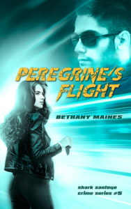
Peregrine’s Flight – the next book in my Shark Santoyo series is almost here (print edition is already available!) and will be available 6/16.

Blurb: Peregrine Hays has always been able to see the angles and fix any situation—but even she can’t fix the death of Shark Santoyo. All Peri wants to do is finally move on, but when mysterious new player Hernan Arroyo comes to town looking for Shark and digging up the past, he unwittingly puts Peri in the path of the Reyes brothers, their hunt for a smuggler of stolen Mayan artifacts, and a shadowy figure known only as the Mannequin. Peri is struggling, but maybe with the help of her friends, she can learn to fly.

Learn more about the series: https://amzn.to/3aUhDuA 

Pre-Order Peregrine’s Flight: https://amzn.to/3eGyan6
Love & Treasure – Surprise it’s a novella! If you like sword fights, treasure-filled caves, and laughs, then you need Love & Treasure.

Blurb: Chase Regard is captain of the nearly-historically-accurate pirate ship Cupid’s Revenge, a pirate-themed restaurant and dinner show, and the mountain of debt that came with both. But Chase has an ace up his sleeve: his ancestor left a heap of treasure somewhere on the coast near Ashville, Oregon. All Chase needs to find it is the help of the red-headed, fiery, and occasionally forgetful, academic Dr. Jenna Mackenzie, the director of the Ashville Museum. But when Chase and Jenna team up they must face the town’s history-buff bully, accusations of theft, and an oncoming storm before they find out that X marks the spot for love and treasure.

Releasing: July 

Thriller Giveaway: Fellow Stiletto author A.B. Plum and I are part of a massive Thriller Giveaway!  60 series starting books AND an e-reader are up for grabs. Last day to enter is 6/10 so click that link quick! Enter for a chance to win here: : https://www.booksweeps.com/giveaway/june-2020/fast-paced-thrillers-series-starters/
Dystopian Games

You’re stuck in a lifeboat in the middle of the ocean with 8 strangers and no food or water, who do you eat first?

Dystopian novels have held a prominent place on our national reading lists for the last few years and while I occasionally enjoy a jaunt into the horrific futures that we could create for ourselves they don’t really speak to me.  To me they frequently seem like the ultimate lifeboat game. While occasionally it’s fun to work through the logic of how to survive in a treacherous situation, the real answer to any lifeboat game is to not get stuck in the lifeboat in the first place.

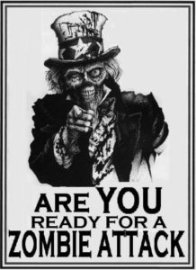
zombie-id

I was reminded of this principle recently when I visited a conference for my day job (graphic design). The conference was for public works personnel (AKA everyone who keeps your city functioning) and their lunch speaker spoke on how their department had handled an earthquake.  From personnel rotation, calling in reinforcements, clearing roadways, reviewing housing safety, clean up – this department moved swiftly with the goal of maintaining safety and returning their town to normal in the shortest amount of time possible (and they did a great job).  But having just read a dystopian novel I was struck by the realization that not one person in the room was thinking… “Bob, I’d eat Bob.”  They weren’t playing the game – they were strategizing about how to not get stuck on the lifeboat.

All of this led to four thoughts.  One – I’m incredibly grateful for our public works personnel.  From sewer maintenance, to bridge engineers, to water management, they deserve more recognition than they get.  Two – All of you great public employees are screwing up a perfectly good dystopian plot line RIGHT NOW.   We’re not supposed to be coming together to overcome a natural disaster and working for the common good!  Come on, people.  Where is the divisive hatred and the reaching for the shotguns? That’s it; I’m breaking out the zombies.  Bob is going to be dinner if I have to have three plot contrivances before breakfast.  Three – We as society need to invest more in infrastructure.  And four – Because we don’t invest more in infrastructure we all need to have 3 days to 2 weeks of supplies on hand depending on where you live.  Be prepared. Don’t let a dystopian novel happen to you.

zombie-e1305310249480

The Dingbat Approach

This month at the Stiletto Gang we’ve been talking about transitions and how moving to a new stage of life can affect writing. But I have to admit that as I sat down to think about the topic all I found myself pondering was the actual literal transitions of writing. One of the primary tasks of a writer is to choose not just what to include, but what to leave out. There are very few (if any?) novels that are told in one long continuous stream of time. And every time the writer skips over the trip to the bathroom or the drive from point A to point B she must choose how to indicate that transition.

Chapter 1
The Hard, Fast Break

Some writers like to make each new location or time switch a new chapter.  It’s concrete. It’s self explanatory. And pretty hard for the reader to get confused. But others like to the soft break.

***

In the typography world those little asterisks are called dingbats. They come in all shapes and sizes and can be themed to the text. Karen Harris Tully‘s series The Faarian Chronicles is a sci-fi young adult adventure centered on a planet that was settled by Amazon warriors of Earth. This gives the featured culture of the planet a Greek historical context (and strong feminist heroines) and makes the transition dingbats of the omega symbol fun and appropriate.

blank space

The softest break of all is the extra space.  As a graphic designer, I’m not in favor of these. It’s far too easy, in a longer work, for the extra space to get buried at the end of the page. Then what does the designer do? Force the text to start lower down on the next page? That looks awkward and can lead to confusion on the part of the reader. Not to mention the fact that coding these for the e-readers and online is more than a little bit difficult.  In other words, if I see these in a book I immediately think the writer is a jerk who doesn’t care about how much extra work their designer has to do.

im_a_designer_not_a_screwdriver_poster-rcc06134967db4a5d92aae443a039d1e6_wvx_8byvr_512Foolishly, when I first got into the publishing biz I found myself incredibly surprised when my layout manuscript came back for proofing that the designer had kept all of my transitions as I had typed them. Somehow I genuinely thought that I would send off my MS and somewhere out in New York someone would do something clever with my transitions.  I was kind of sad.  I didn’t want to manage my own transitions – I wanted someone else to do all the work for me.
Which when I think about it, is about what I think about life transitions as well. How unfortunate that there’s no magic wand or designer to outsource those problems to.  I guess I’m just going to put my lifestyle setting on “dingbat” and see what I get.


Originally published at the Stiletto Gang on 09.14.16

Batting my Lashes

leglampawardIn August I will be the recipient of an award from the local business newspaper – The Business Examiner.  Each year, The Business Examiner, holds a Top 40 Under 40 event celebrating business persons under the age of forty in Tacoma.  This year, my business partner and I are among the recipients!  The event includes a photoshoot for all the recipients and the resulting images get shown on the website and at the event. So of course we did what any sensible business owners would do when on the receiving end of a MAJOR AWARD (careful, it’s fra-jeel-ay)– we put eyelash extensions on the business account.
Now, for those of you who don’t know, eyelash extensions are individual fake lashes that are applied with careful hands, tweezers and glue to your real eyelashes.  The effect is that you have somehow magically grown giant cow length eyelashes.  Unlike a standard set of fake eyelashes that glue on to the eyelid above the lashline, these look integrated into your own lashes.  Basically, your eyes now look like every mascara commercial on TV.

The Stats:  In my neck of the woods they cost about $100 (plus tip) and last about two weeks.  At two weeks you can get a “fill” appointment that can cost $50, but wait until three weeks and that will cost more.  They take about an hour and fifteen minutes to put in and you must be ok with having your eyelids taped in place and have someone poking around on your lash line.

The Pros: As I said, your eyes now look like a mascara commercial ALL the time.  This is great when you just woke up and have no make-up on.  Somehow, I look delightfully rumpled instead of my normal slightly dead.  Since one of the rules is that you can’t wear mascara on them (impossible to clean without taking them out) there is less make-up time involved in getting ready.  And for the most part, people really can’t figure out what you’ve done to look so smashing.

The Cons: My eyes were a bit red and others report a stinging sensation on the first day.  For me, I just felt like I had grit in my eyes for the first two days.  Also, every once in awhile one of the falsies twisted around and stabbed me in the eyeball. Youch! They do have to be treated GENTLY.  If you’re a side sleeper, be prepared to lose a few early after they get ground into your pillow overnight.

Conclusion: If you’re looking at a week with multiple events, particularly ones where you’ll be featured in photos, eyelash extensions might be the way to go.  My business partner had the awards photoshoot, a family picture photoshoot and a high-school reunion in the same week – that’s the kind of week that makes the cost and effort worthwhile.  I probably didn’t need them for one photoshoot, but I’ve enjoyed batting my giant lashes for a few weeks.

ApprovedStamp

Mascara Meh

I was going to say that I was in an on-going search for mascara that gives my lashes the appearance and silkiness of toddler, or one of those ridiculous boy who have won the genetic jack-pot of eyelashes, but don’t have any use for them. But to be perfectly honest, after the last debacle of a mascara purchase I’m simply looking for mascara that doesn’t leave my face covered in speckles of black.

This month I moved on to Scandal Eyes Show Off by Rimmel.  It had a fancy looking brush and exciting packaging design. I base many of my purchasing decisions on packaging design.  My theory is that if you’re the kind of company that can hire a decent graphic designer and then ALSO pay to get their design printed, then chances are that you make a decent product.  Surprisingly, this works fairly often.

However, in this case I was disappointed.  The mascara was clumpy.  It was flaky.  The weird ball brush tip actually got in the way when applying.  Either I needed to use only the ball tip or I need to cut it off so I could use the rest of it.  None of it was so hideous that I threw it away and ran out to buy a different tube; it was just mildly annoying.  And for these reasons, Scandal Eyes does not receive the Carrie Mae seal of approval.  On to the next mascara!

DisavowedStamp

Personal Fitness

Originally published at the Stiletto Gang on 05.11.16

I’m going to let you in on a secret – writing is not for wussies. It’s for old people.

Or at least it makes you feel old. Carpal tunnel. Eye twitches and strains. Aching neck, sore back. The human body was not designed to spend hours sitting at a computer, and the hours compound into stiff muscles that have forgotten how to move. Walking into the kitchen after a prolonged bout of editing, I look like I’ve escaped from the neighborhood old-person jail… er… assisted living facility. I imagine that back when writers were churning out novels by quill and candlelight that it wasn’t any better. But at least back then we were likely to die by forty anyway and probably needed to worry more about childbirth and dental hygiene than whether or not our wrists were a tad achy.

I could trot out some line about suffering for my art, but the truth is, I do many things to combat the muscular stress of sitting and writing. First of all, I got married and had a kid. Although, maybe that wasn’t quite my intended outcome when I started down the aisle, it has to be said that nothing curtails long hours at a computer like a toddler. However, the things I intentionally do to keep myself from becoming Quasimodo include walking / jogging, stretching and keeping up on my martial arts training. And then I whine and complain until my husband gives me a neck rub. And then when all else fails I break down and pay for a massage.

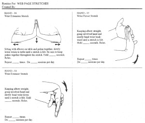
Below are the most common stretches I do for my wrists. These drawings were actually produced by one of my former employers – Visual Health Information. They produce drawings for physical therapists and others to give to patients. I have found all of these to be very helpful for my extended typing lifestyle.

wristhand1

Digital Publishing

By Bethany Maines

Recently, I’ve been learning about the nitty gritty “how-to” of e-publishing.  While there are many how-to’s on how to put your story up for sale in the virtual marketplace, learning how to make an epub file is a lot more difficult and confusing.

As someone trained in how to make print books, this status is infuriating to me.  I can make words magically appear on paper – why is the screen any more difficult?  But as it turns out epub formatting is more akin to website programming than to traditional book design.  Both epub and websites must account for the fact that the designer can never be certain what or how the end user will view their product.  Will it be on a phone, a tablet, or a desktop screen?  Will it be a horizontal or vertical?  Which operating system will be accessing the file?  All of these factors play into how an e-book is seen and creating a file that can be used in ANY format means that many of the traditional design elements beloved by graphic designers, such as color, size, and forced white space, must be set aside. Learning to create an epub is a bit like feeding content into a slot in the wall, letting the machine in the next room whir away, and then trying to guess how the machine works by looking at the book it produces

In the last few years website programming has experienced a burst of development that can make creating a website an almost drag and drop, WYSISWYG experience.  Meanwhile, digital publishing lags behind, still in it’s infancy.

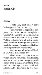
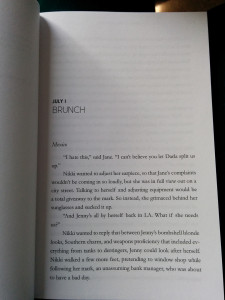
Take a look at these images of the first page of my third Carrie Mae Mystery novel, High-Caliber Concealer.  One is a screen cap from a mobile phone kindle app and the other is a photo of the printed book.

HCC-page1-epub01HCC-page1-print01

You’ll notice several differences – the large area of white space before the chapter title is gone and the fonts are not the same.  Fonts in epub’s must utilize a websafe font or embed the font within the file.  But, not all devices recognize embedded fonts, and they make a file larger and some platforms take a percentage out of an author’s royalty based on download size (you’re hogging space on their server).

However, there are some similarities that the programmer managed to achieve.  Notice how the gap between “Brunch” and “Mexico” mimics the print version?  And you’ll see that while the font isn’t the same, the font hierarchy and general sizing of the chapter information is the same as the print version.

And beyond the appearance of words on a screen there is the tricky business of making all the chapters appear in the right order and having a hyper-linked (click and go) table of contents that allow readers to navigate easily through the book.

No digital book is as simple as a word doc you type at home.  So if you see a well-crafted book on your e-reading device, take a moment to appreciate the book programmer!

Welcome to Hell

Promotion, for a writer, is the seventh ring of hell. By nature we are quiet types who like to sit at home in our PJ’s, eating things like cereal and wine out of boxes and inventing people to talk to. (Yes, I’m aware that’s also the description of crazy people, but I don’t think we need to point that out at this juncture – thank you very much.) So promoting the book, being out in the public, is a terrible fate. Only slightly less awful is talking about promotions in front of other authors. (Oh God, oh God, oh God, what if I’ve been doing it wrong? They’re all going to know I’m a fraud!) But since my other job is a graphic designer, I’m privy to a great marketing secret: you can’t do it wrong because none of it works. Or all of it works depending on your point of view.

Legend has it that when Google presented all their brand new ways of tracking online digital ads to Viacom President and one-time ad man Mel Karmazin, he blurted out, “You’re fucking with the magic!” But the paradigm of ads and marketing being more art than science is still more true than anyone would like to admit, even in this age where digital data practically streams from our ears. Digital tracking will accurately tell you when and where a sale was made, but it never fully encompasses why a sale was made. But at the end of the day, one thing is still true, the only sure fire way to make a sale is to tell someone that you have a product for sale. Marketing is just selecting how you’re going to tell someone about your product.

I’m not a marketing expert, but I know enough to get myself in trouble. So I’ve tried a variety of promotional vehicles that break down into three basic categories: on-line, print, and person to person. By far and away the most successful vehicles are person to person. People telling other people, or the author telling someone to go buy their book works better than just about anything else. (I once sold a book to my state representative when she came doorbelling for votes.) But in the end, you can’t reach everyone you might want to reach in person.

My print experience has been minimal and I think we can all agree that newspapers are dying, so I’ll just skip straight to on-line. I’ve tried Facebook ads & boosts, newsletter ads, and google ads, just to name a few. And in my experience, very few of these things work optimally alone. I get the best results when I do multiple things at once – run a sale and an ad, and then boost the sale on Facebook. This shotgun approach makes it hard to track the mythical beautiful data of click-throughs, but it is very clear when I take one channel away that sales dip. The hard part comes at the end, when I must assess the ROI (Return on Investment) and whether or the sales justify the expense of a particular marketing channel.

UnseenCurrent-DigitalCoversEach author must find what works for them. My only real words of advice are to keep trying. Keep talking. And keep writing. And by the way, have I mentioned that I have a book on sale? An Unseen Current – a great late summer read for only $4.99.

Genre Bending

Originally posted on The Stiletto Gang Blog 03.11.15.

I read Marjorie Brody’s post yesterday “Passion Knows NoGenre” with interest. Marjorie was discussing that she hates being tied to one particular genre, but that the general industry wisdom is to do exactly that – stick to one thing! I love Marjorie’s rebellious flare, but the topic also tied into something I’ve been pondering for awhile: pen names and branding.

As a graphic designer with over a decade of industry experience I have referred to myself periodically as a “branding expert”. Branding is about capturing the concrete and implied qualities of a company or person in their visual, advertising, and on-line representations. Branding seems trivial to some, but as human beings we do it ALL the time. Only most sociologists call it “stereotyping”. Humans seem to prefer to have a short little label to stick on people. We don’t really like being forced to confront the broad spectrum of human reality – it takes too long and we’ve got better things to do with our time. What I do as a graphic designer is try to lodge the preferred stereotype in a consumers mind before they apply their (usually not as complementary) own.

Which is why I don’t usually tell my graphic design clients that I’m a writer.  It confuses my brand.  I can see the thought bubble form: If she writes, then she can’t really be a graphic designer; everyone knows you can’t have TWO talents.  Fortunately, the writer brand is equivalent with “poor” so when I tell writer friends that I also do graphic design they just nod.  But industry wisdom has the same “does not compute” problem with genre.  “But she writes Mystery, she can’t also write (fill in the blank).”

And up until now the only way to write something different was to use a pen name. But with the online world being what it is and with lawyers being blabbermouths, keeping a pen name identity a secret is hard to do.  The other problem is that as writers have become more and more responsible for their own publicity they realize that it’s hard enough getting recognition for one name, let alone building buzz for an entirely new, second name.
Which is why I find the development of the new style of pen name so interesting.  “Wrting as” has become the marketers new favorite phrase. Such as: Laura Spinella writing as L.J. Wilson pens Ruby Ink! (I’m half way through my advance copy and it’s a fantastic, saucy romp of a book – pick it up on March 31!)  “Writing as” is now code for “I’m not writing in the same genre, so be prepared for something different.”  And I couldn’t be happier about it. At last writers have found a way to break out of the genre trap! Perhaps in a few years Pen Names will be the new industry wisdom. We’ll just have to see which pen name Marjorie chooses.